Friday, December 10, 2010

Point 5

The way design is based changes from several staged throughout history. First it goes by theories, then foundations, alternative, reflections, and finally you have explorations. After going through the first four categories what is left is to explore new ideas and expand on what has already been done.

Designers at this point are looking back at what has already been done and using these past ideas to create a new style. As a result they come up with something that looks like the Vanna Ventury House. This house shows a historical mash-up of elements such as the broken pediment, the façade, and the arch for example. With these past elements yet new design it brings up the question of whether design is looking back or looking forward. I believe that it is both. As a way to move forward designers are looking for inspiration and they look to what has worked in the past and evolve it to become the future. The past is not the only place that people are looking for inspiration.

In search of new inspiration designers are turning to art. Since architecture is believe to be the unavoidable art why not make it look more like art if not truly be art itself? This can be seen in the Sydney Opera house, where it abstractly sculpted in order to capture the idea of sails coming up off of the ocean. The structure turned out to please its viewers by its beauty whoever it failed to provide for what it was intended to be used for. The designer failed to take into count the commodity of the building the acoustics of this opera house failed. Like art this building is beautiful and serves as nothing more than something to be admired. I believe that the exploration of art as an inspiration was taken too far. Although architecture could draw inspiration of art it must still follow the idea of commodity, firmness, and delight and well as keeping in mind that architecture is for the people. This brings me to the next idea to be explored.

Good design for all is based on the idea that design should cater to everyone. Everyone should be able to experience good design and with this idea come the idea of the house becomes a machine for living. People are beginning to enjoy the things that facilitate their lives. A great example of this is the Villa Savoye which is designed around the automobile. The lower half of this residential structure is intended for the parking space of the automobile making it part of the home. The house also replaces what it takes from the ground and makes it part of the roof creating a garden roof which is very practical for the resident of this house. As far as good design for all goes the idea was great although it turned into good design for all…who could afford it.

As a result of this course I believe that I now have a better understanding of how design was thought of over the years and all throughout history. The ways of design have changed but it is surprising to see that many element of the past have carried through and can be seen all around us in today’s society.

http://www.marvelbuilding.com/wp-content/uploads/2010/03/VenturiVanna2.jpg
http://www.makingthemodernworld.org.uk/learning_modules/maths/02.TU.03/img/IM.1470_zl.jpg
http://www.galinsky.com/buildings/savoye/savoye3.jpg
http://www.vanderbilt.edu/AnS/Classics/classical_traditions/Domestic%20Interiors/76.JPG
http://syque.com/ds/pix/florence_feb08/santa_maria_novella_800.jpg
http://www.glogerconstruction.com/files/chair_rail.jpg
http://www.websters-online-dictionary.org/images/wiki/wikipedia/commons/thumb/9/95/Stonehenge_Inside_Facing_NE_April_2005.jpg/tonehenge_Inside_Facing_NE_April_2005.jpg

Saturday, December 4, 2010

Tuesday, November 30, 2010

Reading composition 7

Steinway Ghosts, a painting by Claribel Cone, follows the principal and elements of design although it is abstract. Because it is abstract art it operates with a range of forms in order to portray “the many contemporary expressions of modernism” (Roth, pg. 612). This unique piece of art is about “Ghosts of music and adventures and memories…” says the artist who also states that “in this painting shape and windows and air and figures”.
The forms within this painting are brought together using no distinct lines but a series of repeated brush strokes. Everything seems unpredictable yet it fits together as if there is a purposed behind each abstracted piece in respect to another. The vibrant colors and irregular lines and forms come together in harmony with an emphasis on the painting as a whole. There is no one thing to be admired. All of the notes to this musical piece unite in order to create an abstract yet controlled representation of a person’s expression. Art is not the only thing that deals with form. It is very prominent in a lot of architecture, “architects use of forms that are widely and instantly recognizable, drawing on imagery that is comforting and reassuring in a destabilizing world”( Roth, pg. 584) is a way to create art that is not necessarily viewed as are to the average person. All of this also applies to Al Held’s painting the Giza Gate, he abstractly portrays a gate using form but using a different method compared to Caribel Cone. His lines are very distinct and the use of black and white is used to emphasize and unite the forms created. Although both paintings are completely different the design elements and principal are quite similar.
People are looking forward and backward and exploring ways in which to express themselves but they are also looking for inspiration for architecture through the form of art. Architecture is said to be “the art we cannot escape” (Roth, pg. 612). In one way this influenced the commodity of building. Generally buildings were meant to be functional for their purposes but when looking to art as inspiration this point of view changes. Art is mainly viewed for delight, therefore architectures purpose was skewed. Form becomes so important that the function no longer matters. For instance the Sydney Opera House, by Jorn Utzon, is meant to be sculptural and portray sales off of the ocean and it accomplishes this but as a concert hall it lack in some important areas. The interior is problematic when it comes to sounds and due to its end product being an opera house it is useless. This is considered satisfactory because it fulfills what the designer intended the building to look like and not what the building was supposed to be used for but it had to be done “ the image was simply too compelling not to build”.(Roth pg. 554)
“I believe that today there is a need for images, for emotion in architecture; a need for architecture to speak once again to people, to become “presence” once again, to become material, to reacquire a meaning that can sometimes be erotic; a need to reestablish a partnership with people, after decades in which architecture was so antiseptic, distant, after the international style ruined all possibility of communication.” These are the words of Mario Botta which depicts how explorations do not always turn out well because architecture must be intended for the use of all.


Tuesday, November 16, 2010

Reading composition 6

[1]
The Art Nouveau stylistic period was about new designers “replicating past styles but incorporate them into a new, young look” (Massey, pg.175). This style brought a sense of fun into the spaces with the sense of movement. This style was also not focused in a specific location it touched all over the world. Two great example of this style are the Casa Batllo by Antonio Gaudi and the Hotel Tassel by Victor Horta.

The Casa Batllo is located in Spain. It is very different from what people are used to seeing at this point. Gaudis design is very different from the past, since he has a fascination with the human body he incorporates it into his design. Due to the fact that he is working with an already existing building he in a way removes the original skins and applies a new, more surrealistic one. This new façade although smooth, still uses the idea of undulating the façade. Columns are used for support and are visible but they are entirely different from what has been seen in the past, these columns mimic human bones. In a way this building is very baroque considering that it is made of concrete around a metal frame as well as the surface material, in this case it is glass but it is basically portraying art for the sake of art.
The Hotel Tassel is located in Belgium. Victor Horta was able to capture the essence of Art Nouveau through the many curvilinear and moving lines which began with the iron columns which led into the ceilings and walls and made its way across the floor. Design in the past has taken characteristic of nature, Horta in a way does the same although he goes in a completely different direction he gains his inspiration from the machine and translates that into the building itself.
As mentioned previously the Art Nouveau style is not at all focused in one area, Spain and Belgium are only two of the many nations that took part in movement to express are within architectural design. Art for the sake of art is the best way to understand what was going on in terms of design at this point.

[2]
            
At this point designers are attempting to design for the good of all…who could afford it. With the people who can afford what is being designed are starting to appreciate the things that facilitate their lives such as the automobile. Le Corbusier takes the modern movement and runs with it, in a way making “machines for living”. This can be seen in the Villa Savoye. This residential building is based off of the automobile and is raised on pilotis in order to allow for the automobile to be part of the house. This is not the only functional space but Le Corbusier made the roof into a flat space in order to replace what the house has taken from the land. This allows for a garden on the roof that is accessible to the people living there. The Villa Savoye is intended to create an experience through progression rather than ornamentation which leads to the dictum “less in more”. Instead of the clutter seen previously the modern movement focuses on flexibility, function, practicality, and efficiency which can be seen in its open spaces with no applied ornamentation (Harwood, pg. 628).

With this being say I believe that design at this point is about creating practical things to enhance life happiness but not in a materialistic way but rather in a way that is simple and functional.

[3]

Pavilion de L'esprit: Le Corbusier
The Gropius Office at Bauhaus

 
Harwood pg  497 and 500
http://www.essential-architecture.com/STYLE/300px-Villa_savoye_avant.jpg
Massey pg 81

Friday, November 12, 2010

Thursday, November 11, 2010

Point commentary.

By reading my peers points I have come to understand how the alternative and the reflection units can be interpreted in different ways as well as getting the main point across. As a result I have developed a better understanding of the material at hand.


The alternative unit basically means that the people are taking what has already been built and altering it to create something new by breaking the rules and thinking outside the box. This idea brings many past ideas into the present creating a series of revival styles. These ideas were based off of the foundations which is why they continue to expand and move forward and these past ideas, even though sometimes they are not really noticeable, are seen all over in todays society.


Design is moving forward and I have some to understand that the reflection unit is about the series of revolutions, whether political or social, have led to ideas that started turning the wheels of progression and from there design was starting to change. Design languages began to compete with one another and there was a struggle to understand and discover what “modern” truly was. In order to explore what modern was people looked for influences from other counties And the east begins to influence design in the west. As a result I have come to understand that revolution is always present and always will be and that is why the term “modern” can never truly be defined.

The image I chose I believe can relate to both points. I believe that it is breaking the rules and stepping outside the box because it is different to see s till image that produces the illusion of movement as well as the fact that it reflects the wheels that are turning.

Sunday, November 7, 2010

Point4

I believe that the reflections unit is like a cartwheel. First, you start off in a box, meaning you are following the rules. Second, you step out of the box, exploring different possibilities. Third, you turn upside down, breaking the rules. And finally forth, you revert to the box, creating a new set of rules. In other words I have interpreted design at this time to be reflecting back on past ideas then going outside the box in order to create something “modern”.
From one revolution to the next many different design ideas come and go. Many ideas were being revived, but instead looking to Rome as the latest designers have been doing for quite some time people are looking to what Rome based its idea of architecture off of. They decided that Greece was more “pure” compared to Rome therefore reflecting their ideas would most likely be better. Gothic revival was also starting to reappear. A lot of church-like characteristics were being seen in non religious buildings. For instance, Strawberry Hill’s pink room is a perfect example of this with its fan vaults and other similar features.
Not only did people reflect on the past but they also looked to other countries. Since trade was becoming more widespread people were able to experience other cultures. From this, a sense of worldliness started becoming popular. The East was starting to be used as a precedent for design in the West. People in the west wanted to create an “artificial world”, a world of architecture that did not belong and was not normal in its new context. For example the Royal Pavilion in England. This building’s exterior shows great influence from India and even the interior does not look like it belongs in England because of its layers of colorful decorations. Many people were striving for an exotic feel and by pasting other countries architectural ways they are able to create this.
What can you see you reflection in? Perhaps a mirror but for my point I would have to say the Crystal Palace. During the nineteenth century many revolutions arose, one of them being the industrial revolution. With this industrial revolution new materials such as iron and glass come into the field of design. These materials allow for new kinds of structures to be constructed such as the Crystal Palace. The Crystal palace is a show room that in my opinion captures the idea of this unit, it reflects the ideas of the past and the present as well as all of the design languages brought forward from both. It not only reflects the ideas of design though what it carries within it but the Crystal Palace itself is a significant part of what design is leading to.
I believe that this unit draws a very fine line as to what it is trying to express. In my opinion it is like a clock, it is able to grasp the past and move forward in order to create something modern at this point in time. These pictures of clocks in a way show what you would generally think of as a clock and what someone has done to a clock after they step outside the box and go upside down.


http://www.furniturestoreblog.com/2008/05/20/10_coolest_affordable_retro_modern_wall_clocks_under_300.html


Tuesday, November 2, 2010

Reading composition 5


[1]
During the nineteenth century, as the industrial revolution progressed not only were there new building materials but new ways of thinking were developing.
The bathtub is just starting to become common during the industrial revolution. Since sanitation is becoming more and more important bathrooms are starting to be incorporated within the house instead of the common outdoor privy and wash tub that was being used. This is not only due to sanitation issues but also to the fact that cities are becoming homes to many industrial factories that in turn populate the cities making them less private.
The first bathtubs were wood lines with tin or copper and with new building materials, from the industrial revolution, bathtubs are beginning to be made of cast iron. The bath tubs during the mid 19th century were either plain or had an enameled finish and faucets.
I believe that the bathtub represents revolution in design not only for the new materials that the industrial revolution produced but also of wide spread individual plumbing which allows for privacy and convenience that has not been seen to this extent before.


Harwood pg. 22, fg1-35

[2]
During the nineteenth century the east strongly influence design in the west. The fact that trade route started to develop allowed people to bring artifacts from one country to another, in turn spreading characteristics of their own culture.


The French coined the terrn chinoiserie, which means that things contain Chinese qualities whether it’s the intricate pattern of an artifact or elaborate decoration. This chinoiserie wallpaper is a perfect example of an artifact because of its asymmetry and specific pattern. Although it was created in France by a series of craftsmen the design is very Rococo but is strongly influenced by the Chinese. The patterns on this wallpaper resemble the imagery on Chinese ceramics. I believe that the designer had most likely seen an artifact from China with similar qualities and was inspired by it.


The Peacock Room in London is a great example of a space that reflects eastern influence. This space leaves no surface untouched, the lattice work, used for shelving, works its way across the walls displaying Eastern artifacts. Most of all you can see the influence of china in the painted motifs. The style in which the peacocks are painted is borrowed from china in order to create a work of art within a room.


The Royal Pavilion located in England to me seems out of place. If I were to look at this building I would automatically think if was from India. This is what happened when people are able to experience other countries and expand on what they see. The minarets are a perfect example of an architectural idea taken from India as well as the layers of decoration. The ideas behind this building are a sense of exoticism and worldliness and in some ways create an artificial world.


Borrowing ideas from the east does not stop at artifacts or buildings but it also incorporated the place, for example the Kew Gardens in London. The Kew Gardens strongly imitate the gardens in Japan. This twisting landscape is asymmetrical contains many whimsical pathways. As a whole the Kew Gardens seems very tranquil and in touch with nature, which is similar to the Japanese. Even the structure built on this beautiful landscape imitates what you would most likely see in Japan. I believe that the design concept behind these gardens could be something along the lines of experiencing an artificial world as a way to get away from the norm in London.

Saturday, October 23, 2010

POINT3

Throughout this unit I have come to realize that at this point in time architecture only consists of alternatives. People are looking back towards the foundations set by previous architects and designers and exploring boundaries and eventually advance to breaking rules in order to reflect people’s perspectives.

The renaissance was about the revival of old ideas as well as the learning of culture. When looking at architecture during this time you can see that many element of the architecture resembles that of the past but it is used in ways that reflected society as a whole. They revive the classical style and explore it through boundaries on a single decorated façade which in essences shows history. These façade are designed as a way to let the viewer create an idea of a building and this idea is repeated throughout the rest of the structure.

When taking from the past there is a need to make thing one’s own, by doing this people are creating alternative structures and details which reflect upon the ones of the past, meaning that although there are similarities there are great differences too. This is where breaking the rules and testing boundaries comes into play. The Baroque style is a perfect example of this. The Baroque period focuses on illusions and providing a sense of theatricality and movement. For example, the Trevi Fountain in Italy is a sculpted fountain protruding off of a façade of a structure in other word it is breaking the boundaries set for facades before it.

Alternatives of European architecture can also be view in the architecture of America. Since European colonies were based in America they used what they know of architecture tweaked it in order to make it their own and distanced themselves from Europe. In doing this a lot of what we see in America is also seen in Europe, it is as if someone was standing in from of a photocopier and making copy after copy and somewhere down the line the copy will eventually not be the same as the original but it would be apparent of what that copy was based off of.

From what I’ve gathered of this unit is that architecture is like a pizza. It first started in Italy and some traveler came along and loved it. He them went home and tried to recreate it making minor adjustment, whether it was because he didn’t like something on it or that a certain ingredient was not available to him. From there he had his friends taste it who also brought it home and attempted to recreate it. This went on for a long time and now we have the pizza we see today. And if you think about it the pizza we have today reflects society as a whole. We are lazy and don’t want to make our own pizza therefore we have Digiorno’s frozen pizza!

Sunday, October 17, 2010

Reading composition 4

[1]

artifact
Sheraton chair p.522- delicate, symmetrical, urn, swags – classical language
State bed p.502- intricate, mass, delicate ornament, high ornament, wreaths?, repetition, square and circle- dome?, collenette, aedicule- escape
Tall clock p. 473- high ornament, delicate intricacy, swags – classical language, modular, similar to a column- base, shaft, and capital, gilding, swags, cherubs, boundaries, order, symmetry
Windsor chair p.451- delicate, intricate, symmetrical, order, appearance of boundaries
Desk p.427- high ornament, pictorial, flower motif, compartmentalized into geometric shapes- squares, rectangles, hidden elements, displayed wealth- work of art and also functional, showed taste
Space-
Holkham p. 418- rosettes within octagons, dynamic texture, mimicked wall pattern to upholstery, significant contrast between wallpaper and the ceiling and the upholstery, high ornament, broken pediment similar to temple, repetition/contrast, pattern, organized, placed with purpose, contrast in scale of patterns
Gunston Hal p.447- stairs used as an architectural element to be celebrated vs. only being functional, now a statement, became their own space, symmetry, balance of space, repetition- each stair has a banister that corresponds to it that are evenly spaced- balance through repetition
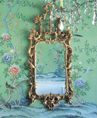
Marie Antoinette p.463- theatrical, high ornament, ordered by pattern but excessively busy, so excessive that the order almost feel chaotic, no sense of direction, don’t know where the eyes should go
Saltram House Saloon p.494- parlor, patterned, compartmentalized, swags, classical motif, symmetry, central arc window with two flat edged windows
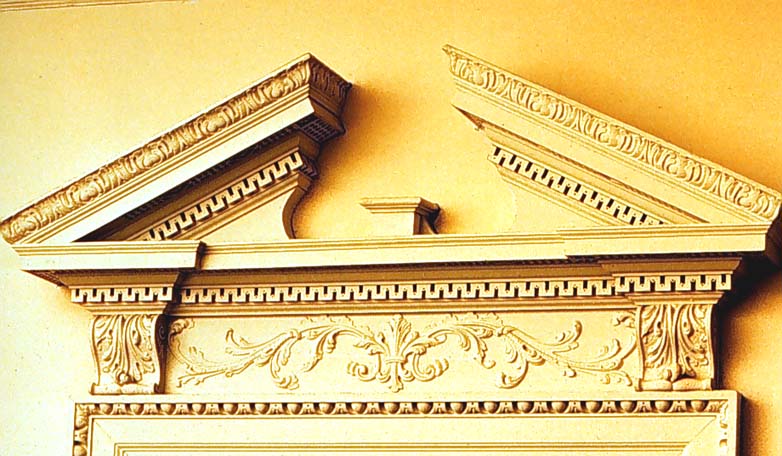
Gardner Pingree p.519- subdued ornament, removed from high ornamentation, classical language, focal point- fireplace, symmetry, central motif planked two swags, centralized ornament on walls (urns), design elements mimicked throughout (fireplaces, and encasement to entrance of room), molding that emphasizes the lines of the room, but also provides a transition from the wall to the ceiling, celebrates the openings, sense of order- prefer things that look finished not abrupt change, prefer something to transition us into the space
Chiswick p.409- based on la rotunda, taking design risks, taking further steps into forming complex geometric shapes, building not high adorned or embellished, sense of calm, focus on symmetry/geometry vs ornament, beauty- minimalist classism, contrast not through ornament but through form that has to do with light
Drayton hall p.437- porticos to mark the front elevation , mimics classical design Doric columns on the bottom, ionic on the top, symmetry, instead of a dome- square on top of square, repetition, emphasis on entrance (told through color- portico encased in white vs brick), different repetition of columns and windows, elements that repeat are the same color (font), even chimneys are symmetrical
St. Genevieve p.460- Greece meets rome Parthenon on base and tempietto san pietro, monumental in scale, public s private, high mass in columns, emphasis on front (columns only on front), engaged pilasters along sides and on center---go in through front to get to center, contrast between solid and void
Nathaniel Russel p.488l- balustrade at top, repeating elements at different scales, windows, , based off of palazzo Medici (bottom to top, public to private), scales help delineate the façade and shows where each floor is on the exterior
Monticello p. 513- portico, dome on top of rectangle, similar to chiswick, octagonal dome, balustrade, clerestory windows of sorts for light in upper room, symmetry, repetition, axial progression towards saloon, then offshoots to private quarters--- separation of public and private, symmetrical balance creates harmony and clarity, but the geometric form different layers, rooms protrude out= more dynamic than buildings of its time, has more volume than traditional symmetrical architecture


artifacts

These artifacts have a common design language that links them together. The Sheraton chair, Tall Clock, Windsor chair, and Desk are all made to fit into a space, and in order to create harmony within a space they are designed with symmetry and the order of the architecture is reflected as well in order to increase harmony and the unity of the space. each piece is intricately detailed with ornamentation within boundaries, this creates an emphasis on the owners good tastes and wealth.

Space

Although styles vary from space to space a common design language can still be seen. Holkham, Gunston Hall, Marie Antoinette, Saltram House Saloon, and Gardner Pingree are all ornamented as an emphasis of what each space is attempting to portray as well as how the owner wants to be portrayed. The ideas of elements such as line are emphasized in each space with a series or borders showing proportions of the spaces as well as a balance with the use of symmetry.

Building

The way I see it is that the Chiswick house, Dayton Hall, St. Genevieve, Nathaniel Russel, and Monticello all have a similar design language. Each building can be related to principals and elements used in the past as well as other buildings. On the exterior of each building you can see repetition and symmetry. There is also an emphasis on geometric forms which have been seen in the past and have been reinvented to become harmonious with these building styles.

place

I believe that the places (England, VA, Paris, New Town, and DC) have a commons language because America looked to Europe as a prototype and as people migrated to America much of what they know about architecture reflected in what was being built. in a way architecture " became what Renaissance architecture was not"(Roth, p.397).


[2] 

england

Gateleg Table(p.264): wood, spindle legs, retractable table, repetition of ornamental motifs and geometric shapes
hart house hall + chamber(p. 260): wood, beamed ceiling, contrast, low ceiling, multipurpose space, cozy, limited light, no decorations, emphasis of simplicity, repetition.
parson capen house(p. 255): small windows, simple, symmetrical, steep roof, dark palette.
boston, ma
spain
Fraileurs(p.283) : decorative detail, repeated motif, Geometric shapes mixed with fluidity, balance and proportional elements.
columbus house(p. 283): beamed ceiling, contrasting palette, detailed ornamentation, repetition of geometric shapes, centrality, open
entry governor's palace (santa fe)(p. 277): horizontal repetition, contrast, smooth, structure showing, geometric, open
st. augustine, fl
france
Armoirs(p.302) : compartmentalized space, symmetrical on an x + y axis, contained boundaries, functionality, geometric space + repetition.
parlange plantation (see plan)(p.292): geometric, boundaries, public versus private, centrality, vernacular mixed with high style
houssaye house(p. 292): stacking, repetition, balanced separation, hierarchy, shows structure, living versus working/storage
new orleans, la
germany/holland
Shrank(p.313) : separation of boundaries, hierarchy, geometric shapes, wood as a material, symmetrical and a balanced separation of public + private spaces
parlor + chamber ,Andrew jackson house(p. 310): beamed ceiling, low intimate space, rustic, multifunctional, simplistic, contrast
single brother's house, salem, nc(p. 307): stacking, geometric, boundaries, sections, mixed materials, showing structure, many windows.
new york city, ny


The English neo Palladian was before Palladio and was drawn from Inigo Jones and Vitruvius as well as the Baroque style. Roth quotes Henry Millon when he says "baroque space is independent and alive- it flows and leads to dramatic culmination" (Roth, p.397), I believe this is what this period is attempting to grasp. During this period there was a focus on country houses, small dwellings, and town houses. Within the architecture you could observe classical details such as ornamentation and the composition showed symmetrical and horizontal all seen in the classical period. The interiors during this period varied from grand to less significant also spoke a classical language. They were also were elaborately decorated and showed monumental proportions. The main elements at this time were structural as well as aesthetically pleasing. A very important thing to keep in mind during the English neo Palladian period is that they followed the rule of design closely.

The American Georgian period focused on the English colonies settling down in America. In order to do this they were looking to discover their own culture, manners, and civility. They looked to England (their homeland) as a prototype in order to base their architecture. In doing do so, their architecture resembled that of England with gentility, formality, and sophistication. During the American Georgian period the domestic buildings were situated near agricultural areas as well as transportation routes for practicality. The interiors at this time reflect the symmetry of the exterior. The design concepts seem to emphasize unity and this is shown through borders and outlines.

The Louis XVI period is Rococo in style and focuses on rational planning and mathematical proportions, with an emphasis on straight lines as well as geometric forms and curves. Simplicity is greatly thought of during this period, with facades consisting of minimal ornamentation and interiors bases of the human scale. The concepts of stability, repose, and clarity were seen in the designs during the Louis XVI period.

The French provincial period was emphasized in rural areas consisting of peasants and bourgeoisie. Much of the local tastes and traditions were seen in the designs but wealth played a role in determining the outcome of the design. It was basically the vernacular interpretation of the high style.There was a strong prominence of functionality therefore much of the structures and ornamentations remained simple

As the European colonies migrated to America they took their knowledge or architecture from their homeland and adapted an alternative in order to reflect their society. They used the principals and elements of design such as repetition, contrast, proportion, and space, as a reference and constructed on the ideas of the past. For example, pizza began in Italy and eventually made its way through time and became what we know pizza as today in America. Through its course from Italy to America it was changed many times in order to reflect the societies whether through its form or ingredients but the harmony of the flavors remain delicious.


[3]


[4]

I believe that the Baroque period stands as a form of social performance in the theatre of the world, "architecture has become but one constituent part in what was "a total work of art"."( Roth, p.404). If you consider the world as a stage during the baroque period you can see that a lot of the architecture is acting. There is a lack of boundaries and a testing of limits which lead to trickery of the eye, in other words Baroque art produces an illusion not only of presence but of motion in the sense that a physicist would understand it: the displacement of a body with mass through three-dimensional space over time. In this sense, baroque art is theatrical: the illusion of motion produces an effect that is both figuratively and literally dramatic.”(Larry F. Norman). During this period the boundaries are inevitably broken and nothing is as it seems, for example Bernini’s Baldacchino looks as if it is draped with fabric but in reality the piece is carved of wood in order to make the viewer perceive it as draped fabric. In saying this during the Baroque period “A wall is never simply a wall, nor a ceiling, a ceiling. Each architectural element is extended beyond its functional duty as a shield from the hostile elements. The aesthetic component of the object, its form, overtakes its function. A wall or a ceiling becomes a possible opening onto the reality which it occludes.” (Larry F. Norman).

Thursday, October 14, 2010

Wednesday, October 6, 2010

POINT2


Throughout our history architecture has evolved. The foundation of architecture began with the ancient civilizations and has gone through the process of being passes from one society to then next and being adapted throughout the course of history into what we see and inhabit at the present day. The ancient societies such as Egypt, Greece, and Rome provided most of the foundations with archetypes, prototypes, and hybrids that influenced the societies and enable them to learn and move forward, creating their own styles which reflected their culture.

Egypt is widely known for its life source, the Nile which runs through the center. Because the Nile is what keeps Egypt fertile and alive they tended to incorporate it into to their architecture, an example would be the papyrus column. Egyptians also based their architecture off of their beliefs. They believe in the afterlife and permanence which was reflected by the scale of their architecture. The tombs such as the pyramids of Giza and temple of Hatshepsut are a very clear example of how gender influenced the design. The pyramids stand out against its surroundings, where as the temple of Hatshepsut is more horizontal and is concealed near the base of a cliff. Although the designs of these monuments were very different they were still constructed by stacking stones and this technique was the foundation for what was to come.

Greece used Egypt as a base for their design. In treating Egypt as a prototype they were able to learn and expand upon it to create the "ideal" architectural structures. They incorporated columns as well as stacking into their architecture because it was a method of firmness. However they designed a lot of their architecture around Greek mythology and their many Gods. Male and female gender roles were still seen in the architecture but were less prominent. For example, the Parthenon dedicated to Athena is very dominant compared to its surroundings. So as for Greece, it borrows and developed the ideas from Egypt in order to create the ideal and in turn ended up with something real.

Rome looked back to Egypt and Greece in order to use their architectural elements as a basis to move forward. Rome is taking what they have seen and modernizing it. They took all of the previous styles and combined them in order to create an instant history. Columns evolved into more of a decoration rather than a structural component. They also developed the arch which took the place of the post and lintel and was much more structurally sound. With this they were able to construct something as magnificent as the Coliseum, which consists of many arches as well as many different styles. By being able to incorporate architectural elements from the past and grow from them Rome’s architecture was the start of something new and was a good foundation in order to move forward.

As I see it the ancient societies started architecture and from them it evolved into what we see all around us today and it is constantly evolving as we learn and experience new times. When we look around us we still see many of the architectural elements that have excelled and lasted for centuries in a way preserving the history of ancient cultures through architecture.

http://stockphotosofarchitecture.com/images/070607152108_Roman_Coliseum_LG.jpg


http://lipsticktocrayons.com/wp-content/uploads/2010/01/7wonders-pyramids_of_giza.jpg

Sunday, October 3, 2010

Friday, October 1, 2010

reading composition 3


[1] Compare and contrast the cathedrals according to the matrix. To illustrate your post, hand draw aview of your “main” cathedral, scan it and place it at the top of your response. Your written thoughtsshould fully illuminate the questions asked with each cathedral pairing on the website.

http://www.uncg.edu/~pllucas/Gothic Cathedrals/website 03.31.08/timelineNEW.htm

Symbol- Florence vs Cologne
The Florence cathedral and the Cologne cathedral both have many symbols but most of them are in fact different. They both stand for different things.
The Florence Cathedral in some ways rivals the Pantheon. Brunelleschi, the designer of the Cathedral, goes to Rome and uses their architecture as precedent for the Florence Cathedral. With this is brings back to classical style in ways keeping in mind humanism, classicism, and man is the center of the universe. Instead of creating something new he is inspired from the past. I believe that it was received by the community because it stands out from what people are used to and expressed a new statement, in a way it is an innovation for people looking to innovate. Its concentration is much more about the form rather than the experience.
The Cologne Cathedral is visually much more gothic. Its main symbol is to portray a heavenly experience. It uses flying buttresses in order to allow more windows to create a sense of dematerialization and verticality in order to make the person feel smaller compared to God. The exterior of the cathedral in a way symbolized people carrying a cross in order to be granted acceptance to heaven.
Both cathedrals have a crucifix form pertaining to the Catholic religion and symbolizing holiness and a way to heaven.

Impression- Florence vs Salisbury
The Florence Cathedral concentrate more on a simple geometric form and uses a classical language where as the Salisbury Cathedral is much more vertical and show many more gothic qualities and it also displaces the classical language. The Florence Cathedra’s palette is much lighter compared to the Salisbury Cathedral. I believe that the Florence Cathedral is much more colorful because it is something new and innovative in a way and the design was chosen by competition where as the Salisbury sticks the what they know of gothic architecture and making a religious experience with its use of flying buttresses, verticality, and stained glass.

Language- Florence vs Amiens
Amiens Cathedrals design concentrates on the standardization of gothic cathedrals, where as the Florence Cathedral bring in a new kind of language concerning form leading to the renaissance. I believe that the Florence Cathedrals language makes more sense because it is moving forward and that is what society is doing at this point. In my opinion the ornamentation in the Florence Cathedral does symbolize change because it is moving away from the rigid gothic style of many other cathedrals and the Amiens Cathedrals gothic ornamentation concentrate on creating a heavenly experience.


[2] This illustration from A Medieval Home Companion depicts woman at work in a medieval interior.Unfortunately, the image is closely cropped so we don’t see much of the rest of the dwelling in which she works. Using Harwood and Roth, complete the rest of the scene using words and images todemonstrate your understanding of the domestic medieval interior .


The domestic medieval life was live slightly through paranoia because of the governmental system at this time. The feudal society demanded fortified places to reside. Which is why the castle because prominent at this time for their safer characteristics such as the wall surrounding the homes (Roth, pg. 305). The residences also did not contain much furniture because of the fear of theft and constant having to pack up quickly and leave. This I probably they there are few things in the interior where the women is.


Wednesday, September 29, 2010

Compass

Wuwu basically relates the column to the male part (the wuwu). In other words size does matter.

The "Out of Body Experience"


As designers we have an obligation to understand how people utilize as well as interact within a space. Because we design spaces for people we must take into account how they will perceive a space, in order to do this designers must be able to view others from an external perspective, in other word they must be able to have an “out of body experience”.

In order to depict how people can be perceived in space I created my own “out of body experience”. Using a three dimensional model of my body I was able to position it in several contexts in which I could view how I might be perceived in a space. I was able to relate the model of my body to its surroundings and begin to visualize the scale and proportions of myself in a space and perceive how others would occupy the space as well. I also captured myself in a series of photographs in order to document my body, physically and digitally, in order to demonstrate how the human body relates to space as well as the components within it.


Wednesday, September 15, 2010

Reading composition 2

1] Hersey describes a grammar for Greek architectural elements based on the idea of sacrifice.
SPECULATE about the validity of his argument based on what you know about Greek design and the
evidence (both visual and written) he provides. (5 points)

The way I see it is that Hersey is telling the story about how Greek sacrifice influenced the architecture that followed. Since sacrifices were meant for the Gods, the Gods are what everything is based around. He speaks of how each God is assigned a tree and those trees are sacred and with these trees the columns were made for the first sacred temples. Then they eventually evolved in order to create a more “ideal” temple in which the details were all drawn from the previous happenings. The ornamentation was named after what is was displaying. For example, Hersey talks about how the column base, not only did the word the Greeks used for this mean “a foot” it also means “footwork- stepping and rhythmic movement” (Hersey, pg, 21). I believe this to be quite interesting because looking back to Greek ruin you are able to see the columns and the rhythm they make. If you pay attention to the way you walk or if you document your footprints or your “footwork” you will notice the Constance spacing of the steps and this can be related back to Hersey’s argument that the Greeks architectural elements were based on their everyday life and grammar as well as their traditions which in this case would be sacrifice. For example, the triglif’s represent the 3 bones or the femur that were kept after the sacrifice, the rings on the base of the column are connected to the bondages around the legs of the animal being sacrificed, and the capital of the column was related to the head of the animal being sacrificed (Hersey, pg, 11-45).


Hersey, pg. 6
[2] Meant in jest, Macaulay shapes a world of the future in which the main character claims meanings for
archeological evidence uncovered at the Motel of the Mysteries. EXTRACT what you believe to be the
lesson of mis-interpreting evidence and link that lesson to the real world phenomenon of the internet. In
other words, EXPLAIN how you might avoid such a blunder as mis-reading evidence when you use the
web as your major information source. (5 points)

I believe that the main character has little knowledge about the archeological evidence he is finding. He seems to assume what the artifacts he is finding are what he preserves them to be. I believe that he may have been misinformed about a lot of this perceiving to this find.
Misinterpreting evidence is very common in today’s society. I believe that people in today’s society abuse the recourses they have, the main one being the internet. Of course we all know that the internet has an incredible amount of information but this information does not do through a process of verification in which all websites are legitimatized. Anyone who has access to the internet can post anything even if it is not factual. Sometimes it is difficult to decipher what is legitimate and what is fabricated. In order to avoid this situation it is important to research your source as well as fine alternative sources which state the same thing, whether it is another website, a book, or even an expert in the field that you are researching. A perfect example of an untrustworthy website would be Wikipedia because anyone can post anything they want there. So it good to know that not everything you read on the web is true and when using the web as a major information sources you have to be careful.
[3] The funerary temple design of Queen Hatshepsut speaks a very different design language than the
pyramidal forms for other pharaohs. From your readings and the ideas addressed in class, RECOUNT
possible reasons why Queen Hatshepsut used this building form. (5 points)

The Temple of Hatshepsut and the pyramids of several pharaohs differ in many ways but mainly by their designs. I believe that the design of each of these tombs have to do with who they were made for. For instants the pyramid were made for pharaoh, men with power who ruled over Egypt, these pyramids were built by stacking stone, starting with a square base, in which all four corner raised and met in the center. The pyramids were covered in white limestone with a gold triangle at the top, with all of this and the flat surroundings the pyramid was able to stand out and be a constant reminder of the pharaoh’s power.
Hatshepsut’s temple was designed much differently although stone was also used, but it is different because it is blended into the surrounding of a large cliff. Since this was a women’s tomb it was not built to symbolize power, it was designed around Hatshepsut’s accomplishments. It was built with the intent of horizontal lines which allowed the temple to be closer to the ground which was to symbolize how Queen Hatshepsut leveled the classes and unified the kingdoms. I believe that her tomb was built lower to the ground to show that she was “down to earth” so to speak.

[4] Although some evidence suggests links between the Egyptian and Greek civilizations, and some
building forms and details provide support for that linkage, the two societies produced design responses
in great contrast to one another. Select a building type (house, tomb, or temple) from each culture and
ELUCIDATE similarities and differences in the two forms over time. Provide an annotated illustration for
each selected type. (5 points)

The Egyptian and Greek culture have some distinct similarities, both the Egyptian temple of Hatshepsut and the Parthenon dedicated to Athena both honor women of different societies but the way they honor the women are both very different. The Temple of Hatshepsut is a tomb for the queen and is mainly hidden within the cliffs surrounding it. This is because the role of gender in society had a much larger gap, whereas the Parthenon is greatly exposed in the top of the acropolis. The women in Greece were becoming more equal compare to Egypt and this shows in where they were built. Both of these temples are emphasized differently within society. Hatshepsut’s temple is much more horizontal compared to the Parthenon which consists of vertical lines. Although both these structures are monumental they both celebrate the women in different ways. The temple of Hatshepsut not only is a place to remember the queen Hatshepsut but also other Gods and the Parthenon is to remember and Praise Athena the Goddess of war and wisdom.
I believe that the pantheon derived from the temple of Hatshepsut. Since Egyptian architecture came first the Greeks we able to study it and use it as a prototype to create “ideal” structures. I can see how the repetitive opening in the temple of Hatshepsut can relate to the use of columns in the Parthenon and the spacing between them. I also can see a resemblance with the spacing of the pediment as well as tympanum. Because these similarities I believe there is a linkage between both of these temple and the time period between.


[5] Harwood shows examples of Egyptian furniture on pp. 60-61. HYPOTHESIZE about the lightweight
nature of Egyptian furniture when compared to tomb architecture, as at the Pyramids of Giza, which
many characterize as massive and heavy. (5 points)

I believe that Egyptian furniture would be considered temporary whereas tomb architecture is more permanent. Egyptian furniture is obviously used in daily life, meaning it is accessible to the living. The furniture is almost always portable and is a symbol of social status. It is also taken to the tomb so that the pharaoh can use it in the afterlife or even replaced.
The tombs are much more eternal. Since Egyptians believed in that life was eternal their architecture was built to reflect this belief, which was to last forever. Also the size difference from the furniture also shows that it is much more of importance and would never be replaced.


[6] Based on a careful reading of the visual evidence in these two images, DRAW OUT an explanation of
design and gender roles as you see both depicted. As this language of urns represents essentially one
of the main ways we know about Grecian culture, COMMENT on the validity of such a practice of
reading evidence. (5 points)


Grecian urns tell a story about events of importance and even some of non important events. These urns show women serving the men which depict the Grecian society and the gap between women and men. These urns allow us to study their society by the stories they tell although how we today may interpret them does not mean it is an accurate assumption of how the Grecians truly lived.


Wednesday, September 8, 2010

POINT


Interior Architecture concerns not only the buildings but the people who build as well as interact with them , according to Roth, the author of Understanding Architecture, “ architecture is arguably the most accurate, the most truly revealing, human cultural artifact”( Roth, pg.12). You could say that architecture is the unavoidable art, one that you can never escape whether it is in your house, your workplace or anywhere else you go. It tells a story about where people are from as well as the cultural influence with the underlying design of buildings. There are many aspects that are involved in interior architecture, it is essential to know about humanity: their needs, way of life, and importantly their culture.
According to Hall culture and language have a great influence on the way people design, how they understand the design process, as well as the way they interpret design in general. Hall has researched the difference between the sensory worlds or Arabs and Americans . He has come to the conclusion that if both, an Arab or American, were to observe the same thing they would use different sense in order to extract data to make their conclusion of the thing ( Hall, pg.3). Because of the difference in culture it is crucial when talking to people that are of a different culture than you to try to communicate by keeping an open mind in the differences between the two cultures. In speaking of this although people of different cultural background may interpret data differently the same basic theory of design is applicable to all people.
Sir Henry Wotton’s theory of commodity, firmness, and delight have a large influence in the area of design. Commodity is the function an object or building is designed to preform. To have good commodity or in other words a good functions it is necessary for a space to able to obtain the maximum performance for what is is designed to do. This is important because at first a space was designed for a particularly objective but what we use spaces for now can change rapidly( Roth, pg.11-14 ). So it is important to know how to use commodity to obtain a well designed object or building, however this is not the only par to design.
Firmness is very important, it can be defined as structural support, but not only is it important to have a strong structure but it is also necessary to make the people in the space feel safe. For instance, if the columns to hold up a beam were the bear minimum to support the weight the scale of them may be questioned by people. Because of this the designers take into account how people react and thicken the columns in order to have a more comfortable and secure look in the peoples eyes ( Roth, pg. 26 ). Taking this into account, the looks or an object or building are also quite important.
Delight is the way an object or building is viewed as enjoyable or aesthetically pleasing. This is important because designers need to be able to make people feel happy in their environment in order for people to be content in using it. A space being ergonomic is also important because to look at a space that is perfectly proportional to the human body and to see how human can interact with the space designed for them. I believe it is a delight to have the space around us built for us to where we do not have to go out of our way to use things that are not the same scale as us.
In conclusion there are many aspects that go into design, culture as well as commodity, firmness, and delight are just a few that have truly stood out to me throughout the first two weeks of class.

Tuesday, August 31, 2010

R E A D I N G C O M P

uncg department of interior architecture : iar 222 : fall semester 2010 : patrick lee lucas
one

[1] Select an object or a building from any time period that you believe meets Wotton’s
definition (as cribbed from Vitruvius) of commodity, firmness, and delight. With an
annotated image, take care to EXPLAIN the ways in which you see the definition
realized through the object or building. Use design language and concepts discussed
in class for dealing with precedents (5 points).


http://4.bp.blogspot.com/_R-_ONwRsAR8/SnnON7jZ32I/AAAAAAAABBI/uFEtLFnm14o/s400/cute_lamps_target_stick_lamp.png

I believe that a lamp fits into Wotton’s definition of commodity, firmness, and delight. As for commodity, a lamp is very useful and serves the wonderful purpose of illuminating certain areas of a room. Its function is supported by many; it is used in a variety of ways that the owner of the lamps wishes to use it whether for reading or adding ambiance to a room. Firmness is described as structural or stable I believe that this lamp is stable; I know this from experience because I own it. It does look delicate but when you pull the switch there is no worry that the lamp will collapse in your hand. Also I believe it look much more durable than it needs to be because of the material it is made on. I feel that the metal that the base and the pipe of the lamp make it look more resilient. I believe that this lamp in particular is very enjoyable because of its pattern and the translucency of the fabric that the light glows trough, this realizes the definition of delight. Delight is defined as being pleasing to look as well as aesthetically pleasing and being able to fit harmoniously into a room. I think the colors and patterns on these lamps are fun allowing the lamp to be thoroughly enjoyed my many people who like the look of this lamp.
In conclusion Wotton’s definition of commodity, firmness, and delight can all be seen within this object.

[2] Working from Harwood et al’s concept of cultural precedents, select one of the
contemporary textiles illustrated above and PINPOINT the influences you see from the
eastern world on the production of fabric in the west. Concentrate on motifs and
patterns provided in Harwood’s text (5 points).


http://allfreed.ru/uploads/posts/1111/13071208612479_495009.jpg

Culture plays a huge role in everything in the world including patterns of fabric. Due to globalization the eastern world definitely influences and vice versa. In relation to this fabric and the influence of the eastern world I believe that it is mostly Japanese due to the asymmetrical patterns but still balanced by the hierarchy of the motifs as well as the colors. The bright pink and the size of the flowers draw your eyes there first. The Japanese strongly support nature you can see this with their beautiful gardens and other landscapes throughout Japan. Harwood states that “nature provide the backdrop and inspiration for all design” in my opinions this supports my view that this may indeed be influenced by the Japanese culture.

[3] When considering perceptions of personal and social space, Hall and others
suggest that different cultures have different space needs and attitudes. Most
consider that citizens of the U.S. generally feel a need for more space. How does this
play out in the classroom in which we gather for iar222? (5 points)

I believe that it depends a lot on culture but also how people are brought up. There are some families where each child has their own bedroom and bathroom and others have five children who have to share everything they have. The children who do not have to share are going to be used to more space compared to the children who do have to share. In saying this I believe that different people in our classroom are going to interpret personal space differently. In our classroom I feel very crowded even though it is a large room due the fact that we are all sitting within the first few rows. The seats are close together and we share an armrest with the person next to us. I also think that our classroom was made thinking that everyone was the same average size which is not true. For instance I have much more room in the space that I sit in that a larger person. And being larger in a tight space is not comfortable. Even me being smaller I feel that whenever I move around I may bump the person beside me. I feel that the space uncomfortable but manageable. People can deal with spaces that are close to others but for the most part we try to avoid them the “personal bubble” has become something that if invaded can cause a confrontation.

[4] SPECULATE about whether or not there can be an architecture of happiness, as de
Botton writes in the work by the same title. Provide a juicy quote that helps give
evidence to your views from the passage that you read. Include an annotated image of
a happy object, space, building, or place and specify WHY and HOW your example
exudes happiness (5 points)

http://mytwogirls.net/wp-content/uploads/2010/01/jungle%20gym.jpg

http://www.furgler.at/wcms/Clients/156200522030730/Images/3044855200551071411.JPG

“ An ugly room can coagulate any loose suspicious as to the incompleteness of life, while a sun-lit one set with honey colored limestone tiles can lead to whatever is most hopeful within us” by De Botton helps show how I feel about an architecture of happiness. I believe that there are things in life that do make people happy such as bright colors, openness, light, and a sense of comfort. This can be interpreted by the way you look at things whether you pay attention to the detail of the navigation of space, or even the form and delight of the object of building. All these things are taken into consideration when creating a space that will please people and make them feel happy. For instance I believe that a child’s jungle gym is made for their enjoyment and happiness. This is shown through the bright and happy colors and the fun and interesting thing to interact with. I do not thing that a black and gray jungle gym would be able to cause a fun and carefree environment.