[sketchy time]
Saturday, March 15, 2014
I have been hooked on Facebook before. I sometimes still am, but one of the things I have come to discover is that I don't like having Facebook friends that I am not friends with in real life, even if I know you it does not mean that we are friends and just because we are "Facebook Friends" also doesn't mean that I am your friend. Unfortunately people do not think the same as me and seem to be upset when i delete them on Facebook even if we haven't spoken in over a year. As I delete people i tend to get "delete happy" and have now developed a system which allows me to keep or delete.
Friday, January 24, 2014
Doodling is a must Do!
Check out this article it shows that doodling serves an actual function andais not just an artsy fartsy person spacing out. This is great news for me since I wish my job cpuld be doodling all day long. Half the time I don't even realize I'm doing it.
Saturday, November 30, 2013
patterns and patterns in life
what a great way to add patterns to a space. i think i'm going to start a new projects of decorating my apartment. hardly looks like home right now but i think its time to official make it "ours". looking into ways of adding colors, patterns and textures with having to paint the walls...


just some ideas
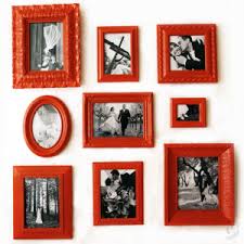
i love this living room! not necessarily the furniture but the colors and patterns also the details like the two portraits in the corner. nothing like a good mug shot.

Saturday, April 6, 2013
Saturday, March 30, 2013
Acoustice Wall Art: leaf panels
Still using the Emancipation Proclamation Live Oak Tree as inspiration, I have used the shape if its leaves to create and acoustic panel, playing with the scale of the leaf. I am planning on cutting out part of the out line of the leaf and sewing(or something else) the area neared to the connection together allowing it to stay elevated slightly so that the white can show through the cut spaces.
Acoutic Wall Art: Bedroom
Using my acoustic wall art idea I am moving forward to the bedroom. By placing a piece above the bed it can also functions as a headboard. I am exploring different shapes and quantities of the panels, whether I should make it looks as a canvas, work with horizontals seen on the wood panels on the wall to the left, or devide it in 2 or 4. I am still working on the design that will go on these panels, but it may change depending on what conposition i end up using. Feedback?
Acoustic Wall Art Ideastions
I am playing with colors for the Tree Wall Art, I am presently leaning toward the green with white tree or brown with green tree. The colors are taken from what we see in the house, the red Diem wall, the accent green from the back splash, the brown from the wood. This piece was previously made of wood but I am changing it to be made of a material call QuietBrace (http://www.homedepot.com/p/QuietBrace-1-2-in-x-4-ft-x-8-ft-Sound-Deadening-Structural-Insulating-Sheathing-3103308/202089176#.UVcoJxwqZf8) which is a sounds dampening material, which I will cover with felt with the design and colors. These panels will not only look like art but will function as acoustic panels. I have also increased the size of the piece to be the same length as the TV to bring balance to the space. If anyone has any feed back on the colors, or any other ideas of color combination or the previous size (small) or larger size, which can be seen below in comparison to the TV. I am more than happy to get feedback!
How to make you own acoustic panels.
Sunday, March 24, 2013
ACOUSTIC wall art
presently in studio i am focusing on functional art. which started off as being wall decor as a storage place for place mats but has now taken an interesting turn. my wall art is to be designed for the Canopy House, UNCG students and faculty have decided to assist team Tidewater with the interior aspects of the house.after showing them my preliminary intent i was given some feed back to possibly turn my wall art panels into acoustic panels. at first the idea was difficult to grasp, partially because i hadn't even considered it. the image above shows my precedent study of different methods of making acoustic tiles. since these tiles are to be placed through out the house i want to focus on making each set of panels for each room different because this is a residential project. not many peoples homes have the same artwork in each room or even the same configuration of artwork. my challenge now is to focus on creating unique acoustic artwork embodying the personalty and concepts of the home.
Friday, March 8, 2013
"Every Rose has a Thorn"
Drawn after being inspired by the song "Every Rose Has a Thorn" by the band Poison ( http://www.youtube.com/watch?v=j2r2nDhTzO4). Everyone has there differences and own problems, no one is perfect, but striving to do your best is all you can do to better yourself in the world. Never stop growing, we all have our thorns but the point is to bloom into something wonderful a rose.
Monday, February 11, 2013
Bee-utiful day
Saturday Feburary 9th, a typical morning walking to the library on campus. Warm sun and cold crisp wind stinging my face and fingers. It isn't even spring yet but hidden behind some dead shrubbery were these bee-utiful pink flowers. I have no clue what type of flower these are but what I do know is that it was a change from the winter and I know that spring is just around the corner with warm weather and sunny days to come, which is much needed these days.
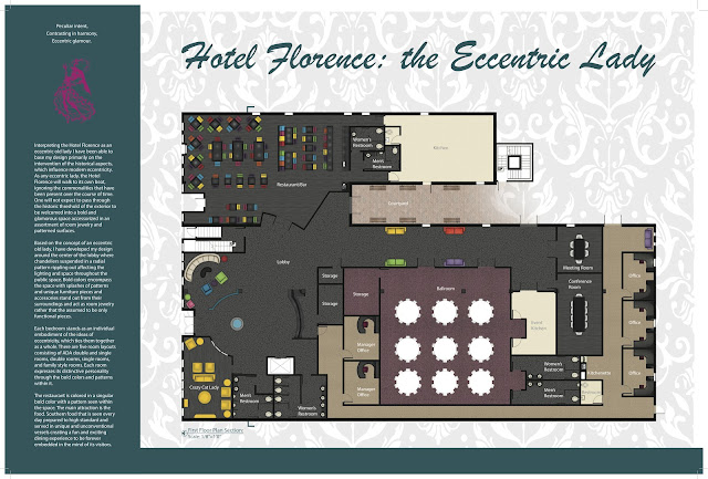
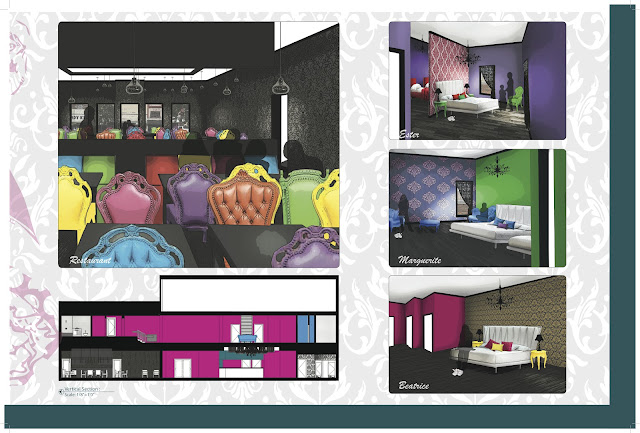
Hotel Florence: the eccentric lady
Interpreting the Hotel Florence as an eccentric old lady I have been able to base my design primarily on the intervention of the historical aspects which influence modern eccentricity. As any eccentric lady, the Hotel Florence will walk to its own beat, ignoring the commonalities that have been present over the course of time. One will not expect to pass through the historic threshold of the exterior to be welcomed into a bold and glamorous space accessorized in an assortment of room jewelry and patterned surfaces.
Based on the concept of an eccentric old lady I have developed my design around the center of the lobby where chandeliers suspended in a radial pattern rippling out affecting the lighting and space throughout the public space. Bold colors encompass the space with splashes of patterns and unique furniture pieces and accessories that stand out from their surroundings and acting as room jewelry rather that the assumed to be only functional pieces.
Each bedrooms stands as an individual embody the ideas of eccentricity which ties them together as a whole. There are five room layouts consisting or ADA double and single rooms, double rooms, single rooms, and family style rooms. Each room expresses its distinctive personality through the bold colors and patterns within it.
The restaurant is colored in a singular bold color with a light pattering seen within the space. The main attraction is the food. Southern food, that is seen every day prepared to high standard and served in unique and unconventional vessels creating and fun and exciting dining experience to be forever embedded in the mind of its visitors.
Thursday, February 7, 2013
Its been a while
It is presently my last semester at UNCG, on May 10th I will be graduating with a Bachelors of Fine Arts in Interior Architecture (known to most as Design). I already have a job at Phillips Collection and I am truly inspired with what they do. You can check the out at http://www.phillipscollection.com/. They are pretty awesome! I have learned so much with this company and know I have a really long way to go and lots more to learn which I love!
As one of my new year resolution I decided that I want to learn how to cook. I never thought that I would enjoy it. I always thought you had to cook because you have to eat, but no, it is one of my new fav things to do. Have a glass of wine and blast some music! Theres nothing to it...unless as usualy I have no clue what I am doing. In that case my mom gets about a dozen calls full of questions that she thinks is comon sense (I still believe they are legit questions though). By the way I have taken picture of all my meals. I will definatly be posting them soon!
The boyfried...well what can I say? I am as happy as ever. We've been together a little over three years and I still get butterflies when I see him.
Anyways, that is pretty much how things are going and this is me.
Saturday, March 24, 2012
Do something about it!!
My studio has recently been combined with the other half of the 3rd year studio. We are joining forces to study and develop ideas to improve the space we spend so much time in together, the Studio. The first step of the project was research and documentation of the space as well as the people in it. This being said we were divided into groups and assigned different topics to collect information for. The groups are as followed: floor plan, survey and interviews, social and behavioral factors of Iarc, spaces and precedents, lighting, furniture, pin up spaces, electrical delivery, window treatments, teaching pedagogies, and meeting, reception, and gathering spaces.
Floor plan
While studying the buildings drawings this group compared the drawings to what was actually constructed within the Gatewood Studio Art building. While studying this they noticed that many of the specified aspects that were supposed to be in the spaces were engineer valued out. Our actual department had to spend the money on some of our specified necessities that never made it in the building.
Survey and interviews
This was the part of the research that I took part in. by doing surveys and interviews with the people who spend the most time within our space we learned that it wasn’t so much the space that worked it was the people in it who made it inspiring. Many problems were also pointed out during this process. We also learned about the student and how much time they actually spend in the space.
Social and behavioral factors of Iarc
This group concluded that “we” are Iarc. This being said the students create their own boundaries with what they are giving. People discover what works and what doesn’t through trial and error. Even though this is said we all have needs whether they are individual or group based. We have come to the conclusion that the makeshift things we create for ourselves can become permanent solutions if we do something about it. As young designers personalization is part of our character and when we realize what we are truly capable of it all comes down to “whose studio is it” and what do we want to do about it?
Spaces and precedents
When looking at what kinds of spaces should be included within our building, this group has come up with several solutions to our problems. Within a student’s personal space one needs storage and a space to personalize, create, and inspire. Spaces that are seen in our building are sterile and simply white. Adding colors and textures and using this within creative ways to solve problems such as noise who all a more enjoyable atmosphere to our space. In researching what works this group believe that the best space would be multifunctional in nature.
Lighting, furniture, pin up spaces
The space as we know it now is filled with daylight during the day, although it is beautiful and good for being productive the glare can sometimes be an issue. Also the electric light within the space are on timers and are on during the day (which isn’t necessary) and only partially on at night. Increasing task lighting would assist in creating a better work environment. The furniture plays a big part in the space. By making the space multifunctional furniture is a big issue. It is difficult to decide whether to have more individual spaces or community spaces. One thing is for sure we are lacking in comfortable furniture. Pinup space is needed within our major. It is a way to present and display the work we have produced. Modular panels would greatly benefit the space by allowing for flexibility. Pin up spaces could also bring color and texture into the space and offer a solution to our acoustical problem. It is also suggested that a pinup space could also be a creative.
Electrical delivery
At the moment our power source are floor pockets, these “holes in the floor” that become a hazard and are very impractical. There are many ways in which to solve this problem but figuring out which one is best for the space is difficult and can be costly. The rearrangement of furniture could be set over the floor pockets in order to provide power to work stations.
Window treatments
There is an abundance of daylight within the studio space but the glare that is projected from the sun makes the space uncomfortable. We presently have blind which are indeed ugly and either allows an abundance of light on the space of block it out completely. There needs to be a happy medium or at least a way to diffuse the light without completely illuminating it or even a way to use it to possibly collect energy through solar power.
Teaching pedagogies/ Meeting, reception, and gathering
It is encouraged that one should create their own experience. Within a space one should adapt and be able to inspire. Community is also a big part of this major. Creating a better community space allowing for larger groups to all sit cohesively together would enforce this sense all the students have with one and other.
“Small spaces come with imperfections but they are there” –Patty
So what should we do about it???
Saturday, March 17, 2012
Thursday, March 15, 2012
Visual exploration and explanation
Community
Community is a unified body of individuals. The differences between people within a community allows for each individual’s true colors to show. Everyone is as unique as a Fruit Loop, but when all the different colored Fruit Loops come together in a bowl filled with milk they are connected by a common diversity.
Stewardship
Stewardship is the responsibility to take care of something entrusted to one’s care. Everyone in the world takes part in something within their community whether it is a small act of kindness or a large act of generosity. Taking part in something bigger than one’s self and utilizing one’s potential allows for the maintenance and improvement of the world as we know it. Bats are a perfect example of this; they fly around during the night doing their part by illuminating mosquitos allowing us to enjoy our evenings. Although this is a natural process they have been continually doing their part and when something works it should continue.
Innovation
Innovation is the introduction of something new. As time moves forward the things we experience in life constantly change. An invention of the past becomes an innovation of the future by being adapted and evolving in ways in which enhance it. in other words if you are able to use the phrase “ the best thing since sliced bread” then what you are experiencing must be ground breaking and a success in itself
Authenticity is the real or trueness of something. As the world moves forward one thing remains constant, one thing happens no matter what and it is this thing that cannot be faked and it is life. In the beginning of life everything starts the same. We all start out as an egg and develop into an original being. This ability to be generated has survived the test of time and will continue to be genuine.
Subscribe to:
Comments (Atom)


